Chapter 3 Mapping with R
Spatial analysis packages not only provide the necessary means for accessing and manipulating spatial information, but also provide us with functions aimed at creating cartography. Although it is possible to create really aesthetic maps, doing so is quite difficulty and we will probably be more comfortable designing our cartography in a desktop GIS. However, we can create maps that meet the minimum standards of cartographic design within R with not too many lines of code.
In my view, these functions will help us to quickly and easily ensure that we have properly accessed spatial information or that our results are adequate.
3.1 Basic mapping
Let’s go from the simple to the complex little by little. Getting a graphical representation of spatial information (we still can not call this map) is very easy. Do you remember the plot() function? Actually we have already seen it applied to spatial information in the previous topic, so you should remember it. The different packages of spatial information (Maptools, raster …) add functionalities so that we can use this function to represent spatial information.
We can use plot() function with both raster and vector layers, although the result is somewhat different in each case. In vector layers we will get a “map” representing spatial features in black and white. Raster layers are plotted as an image with a default color ramp. Let’s look at an example. In the mapping folder you will find a layer called la_rioja.shp (representing the location of several agro-climatic stations in La Rioja) and an image called mde_rioja.tif9. We will load these layers into 2 objects and then use plot() on each one:
library(rgdal)
rioja<-readOGR('Data/mapping/la_rioja.shp')
## OGR data source with driver: ESRI Shapefile
## Source: "C:\Users\rmarc\Desktop\Copia_pen\European_Forestry_Master\module-3\Data\mapping\la_rioja.shp", layer: "la_rioja"
## with 1 features
## It has 3 fieldsplot(rioja)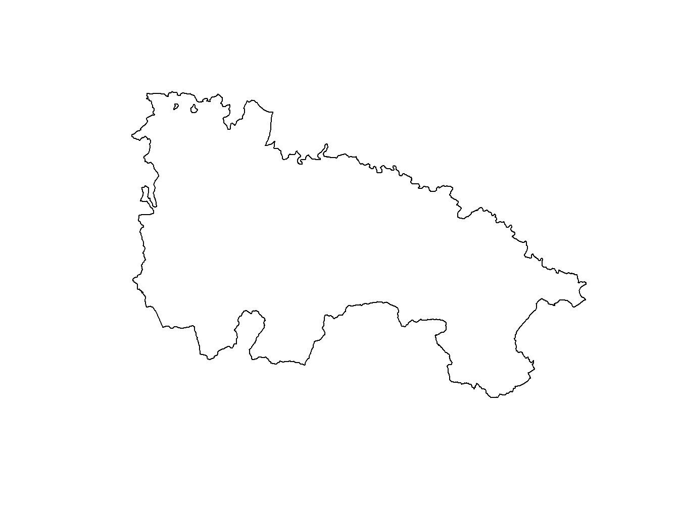
dem.rioja<-raster('Data/mapping/dem_rioja.tif')
plot(dem.rioja)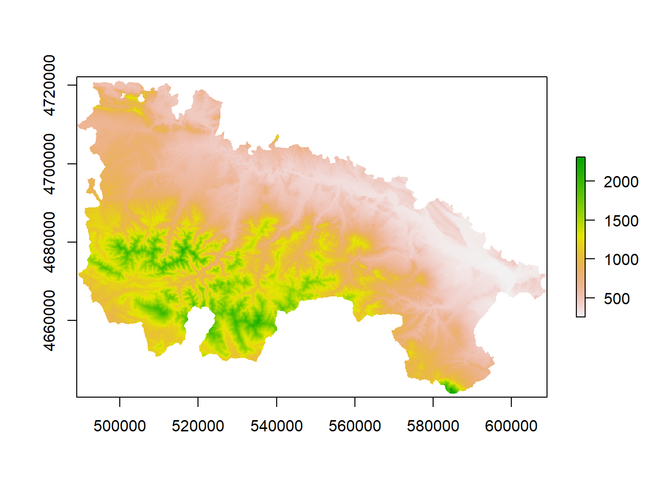
Since we are using the plot() function we can use the arguments that we saw in the Module 1. We can add titles to axis, change colors, change the symbol for points, etc. Let’s look at an example with the station layer stations_rioja.shp. This is a layer of points with which we will see how to change the type of symbol for points and even a brief incursion to combine differnt spatial layers:
stations.rioja<-readOGR('Data/mapping/stations_rioja.shp')## OGR data source with driver: ESRI Shapefile
## Source: "C:\Users\rmarc\Desktop\Copia_pen\European_Forestry_Master\module-3\Data\mapping\stations_rioja.shp", layer: "stations_rioja"
## with 21 features
## It has 5 fieldsplot(stations.rioja , pch = 21, main='Agro-climatic station in La Rioja')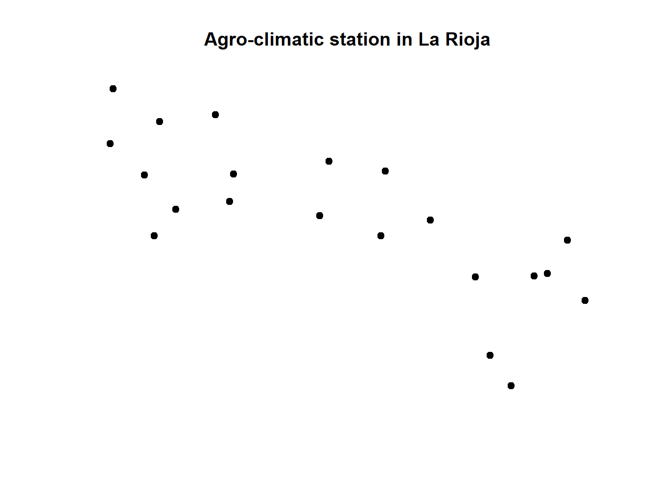
We can add the limits of the region already stored in rioja using lines(). But first we have to specify the CRS and reproject one of them:
crs(rioja)## CRS arguments: +proj=longlat +ellps=GRS80 +no_defscrs(stations.rioja)## CRS arguments: NAextent(rioja)## class : Extent
## xmin : -3.134271
## xmax : -1.678701
## ymin : 41.91903
## ymax : 42.64426extent(stations.rioja)## class : Extent
## xmin : 496143
## xmax : 603302.1
## ymin : 4651108
## ymax : 4718094After checking CRS and extent we can definetely say that one layer has geographic coordinates (rioja) and the other projected (stations.rioja). In fact one uses WGS84 (EPGS:4326) and the other UTM ED50 (EPSG:23030). We can check the appropriate reference in http://spatialreference.org/. Let’s assign them projections and the project rioja to EPSG:23030:
crs(rioja)<-"+proj=longlat +ellps=WGS84 +datum=WGS84 +no_defs "
crs(stations.rioja)<-"+proj=utm +zone=30 +ellps=intl +units=m +no_defs"
rioja.ED50<-spTransform(rioja,"+proj=utm +zone=30 +ellps=intl +units=m +no_defs")
Once our layer shar CRS we can combine them:
stations.rioja<-readOGR('Data/mapping/stations_rioja.shp')## OGR data source with driver: ESRI Shapefile
## Source: "C:\Users\rmarc\Desktop\Copia_pen\European_Forestry_Master\module-3\Data\mapping\stations_rioja.shp", layer: "stations_rioja"
## with 21 features
## It has 5 fieldsplot(stations.rioja, pch = 21, main='Agro-climatic station in La Rioja')
lines(rioja.ED50)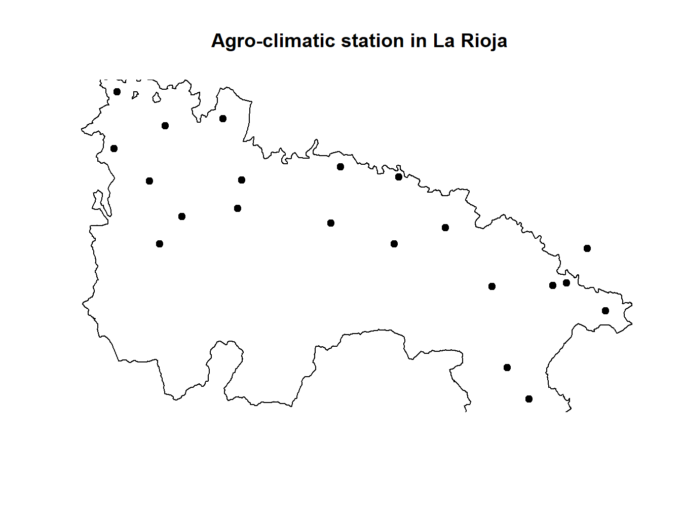
If we proceed in this way the plot we get is somewhat cut-off on the borders. This is the same that happened in the line plots we saw in Module one. The easiest way to solve it is calling plot() on the biggest layer (rioja.ED50 in this particular case). Doing so implies we have to call stations.rioja afterwards but using points() instead of lines():
stations.rioja<-readOGR('Data/mapping/stations_rioja.shp')## OGR data source with driver: ESRI Shapefile
## Source: "C:\Users\rmarc\Desktop\Copia_pen\European_Forestry_Master\module-3\Data\mapping\stations_rioja.shp", layer: "stations_rioja"
## with 21 features
## It has 5 fieldsplot(rioja.ED50, main='Agro-climatic station in La Rioja')
points(stations.rioja, pch = 21)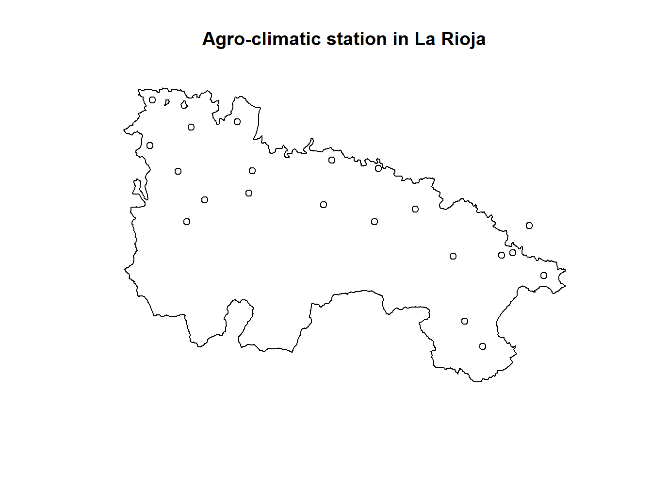
We can also start by plotting dem.rioja and overlay rioja.ED50 and stations.rioja10:
dem.rioja<-raster('Data/mapping/dem_rioja.tif')
plot(dem.rioja, main='Agro-climatic stations in La Rioja', xlab='Longitude' , ylab = 'Latitude')
lines(rioja.ED50)
points(stations.rioja, pch = 21, bg= 'red')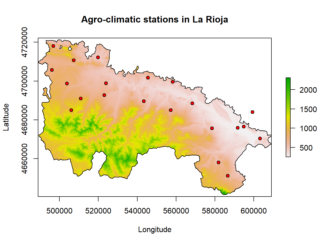
This is kind of a nice map, but it lacks several features such as north-arrow or a proper legend. Indeed we can do that and continue using plot() but there much nicer ways to go.
3.2 Mapping with spplot()
This is a specific function to design cartography and is available in the sp package. Its use is very simple, With 2 arguments we can create a basic map that will represent a variable. This function is useful for both vector and raster data, although we will get more out of it for the first ones since it allows to create multiple maps with a single instruction.
I must be clear from the beginning that the only difference between mapping raster or vector data is that raster layers only represent one parameter and vector layers can store many attributes.
The simplest example is mapping a single attribute or, leaving the rest of the parameters by default. The syntax of this statement is simple:
spplot (Layer object, [attribute])Where the Layer object is an object in which we have stored a layer (either raster or vector) and attribute is a column or attribute to specify as a text string in the case of vector layers. For the examples of spplot() we will use the layer weather-stations.shp from which we created the spatial linear regressio model, and the predicted raster layer which I named tavg.tif. Mapping outputs from regression models is one of the most commons tasks:
First, we install the sp package and load the layers:
install.packages('sp')
library(sp)stations<-readOGR('Data/weather_stations.shp')## OGR data source with driver: ESRI Shapefile
## Source: "C:\Users\rmarc\Desktop\Copia_pen\European_Forestry_Master\module-3\Data\weather_stations.shp", layer: "weather_stations"
## with 95 features
## It has 10 fieldstavg<-raster('tavg.tif')The we start by mapping Tmed_MES from stations:
spplot(stations,'Tmed_MES')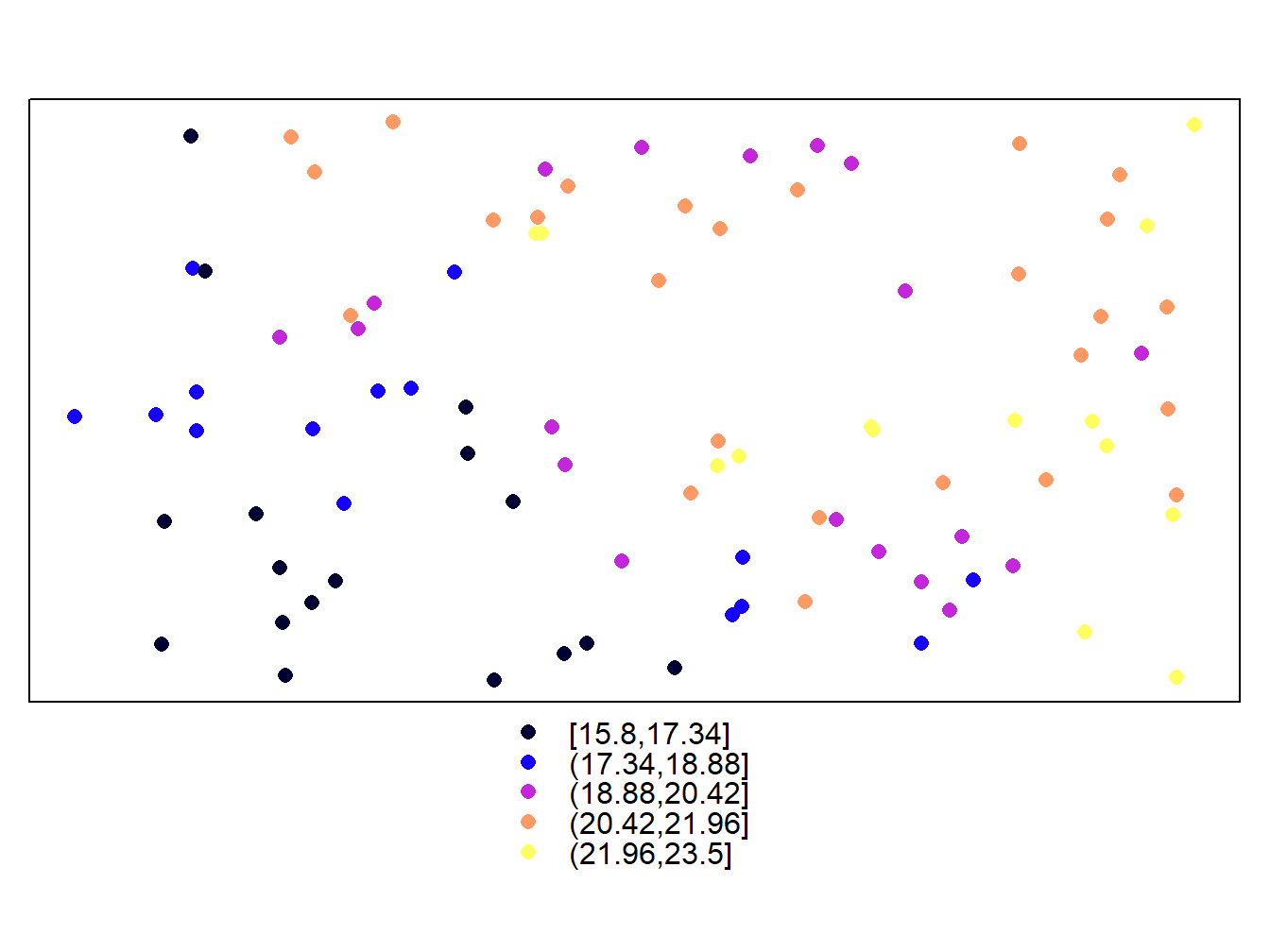
spplot(tavg)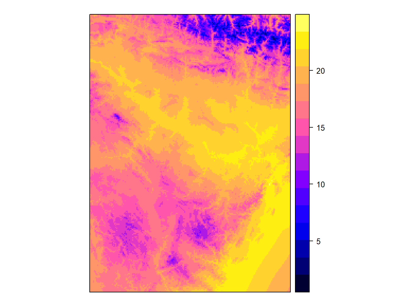
Simple, right? The truth is that this is the function that we will allow more easily create maps. If you look we can see some common elements and differences between raster and vector maps. As you can see the default color palette is the same in both cases, although the type of legend is different. It is important to note that, by default, in the case of vector layers the representation is done at intervals, whereas in the raster layers a continuous ramp is used.
Next we will add and modify some elements to improve our map so that it can be actually considered a map (with legend, scale, north …). The first thing we will do is add a grid on the marging with coordinates with scales=list(draw = TRUE):
spplot(tavg, scales=list(draw = TRUE))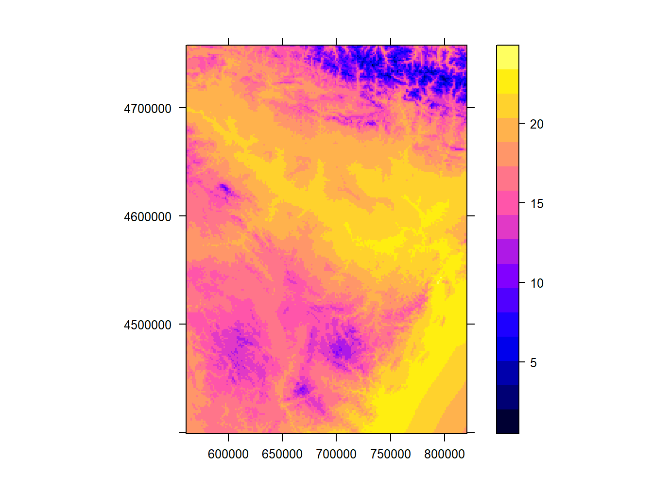
Well, now comes something that, while not complicated, is quite tedious. What we are going to do is add north and scale. This may seem trivial but it is not. It is not because there is really no specific function to add these elements automatically. On the contrary, what is done is to call different elements and allocate them on the map manually. Once the elements are created we call them inside the spplot() function. Run the following example:
scale = list("SpatialPolygonsRescale", layout.scale.bar(),offset = c(495000,4645000), scale = 20000, fill=c("transparent","black"), which = 1)
arrow = list("SpatialPolygonsRescale", layout.north.arrow(), offset = c(600000,4705000), scale = 10000)
text1 = list("sp.text", c(495000,4643500), "0", cex = .7, which = 1)
text2 = list("sp.text", c(518000,4643500), "20 km",cex = .7,  which = 1)
spplot(dem.rioja,scales=list(draw = TRUE),sp.layout = list(scale,text1,text2,arrow))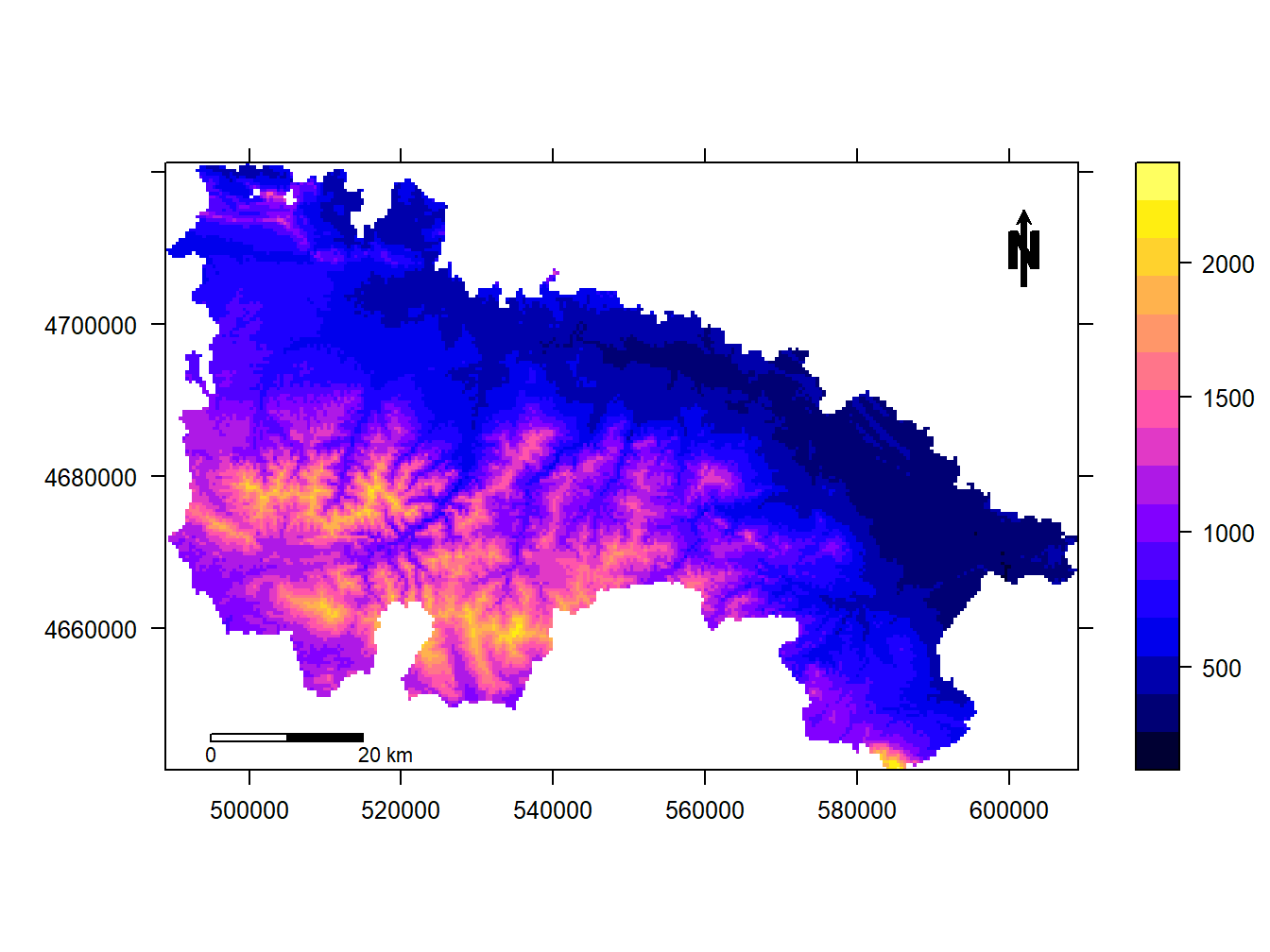
What is done in the example is to create the scale bar, specifying position and dimensions according to the units of the CRS. Then, we do the same with the north arrow.
Another option that we may be interested in is to change the intervals of the legend. Unlike what did to add north arrow and scale, this is pretty straightforward. We simply use the cuts argument in the case of vector layers and at in the case of raster layers. Then we pass a vector with the cut-off points of the intervals:
cuts<-c(15,18,22)
spplot(stations,'Tmed_MES',cuts = cuts)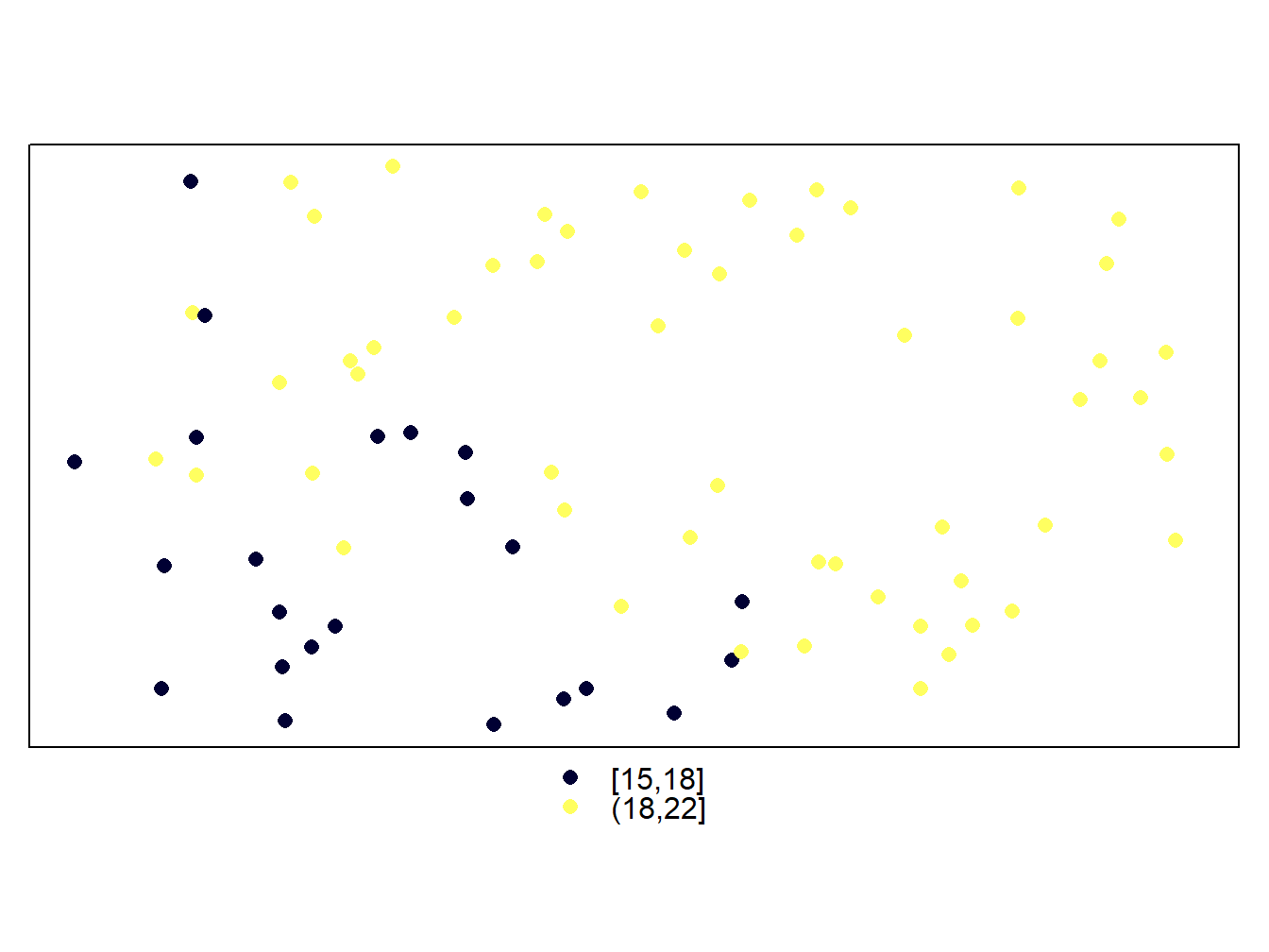
cuts<-c(500,1000,1500,2000)
spplot(dem.rioja,at = cuts)
Be carefull when specifying new intervals. Any feature or pixel that falls outside those intervales will not be mapped. That’s why we have less points in the wStations map and a blank hollow in the dem.rioja one. On the other hand, the legend in maps from vector layers is updated automatically. However, the labels in the raster maps remain the same. If we want to adapt the legend to the new intervals we have to do it manually using colorkey:
cuts<-c(500,1000,1500,2000)
spplot(dem.rioja,at = cuts,colorkey=list(at=cuts,labels=as.character(cuts)))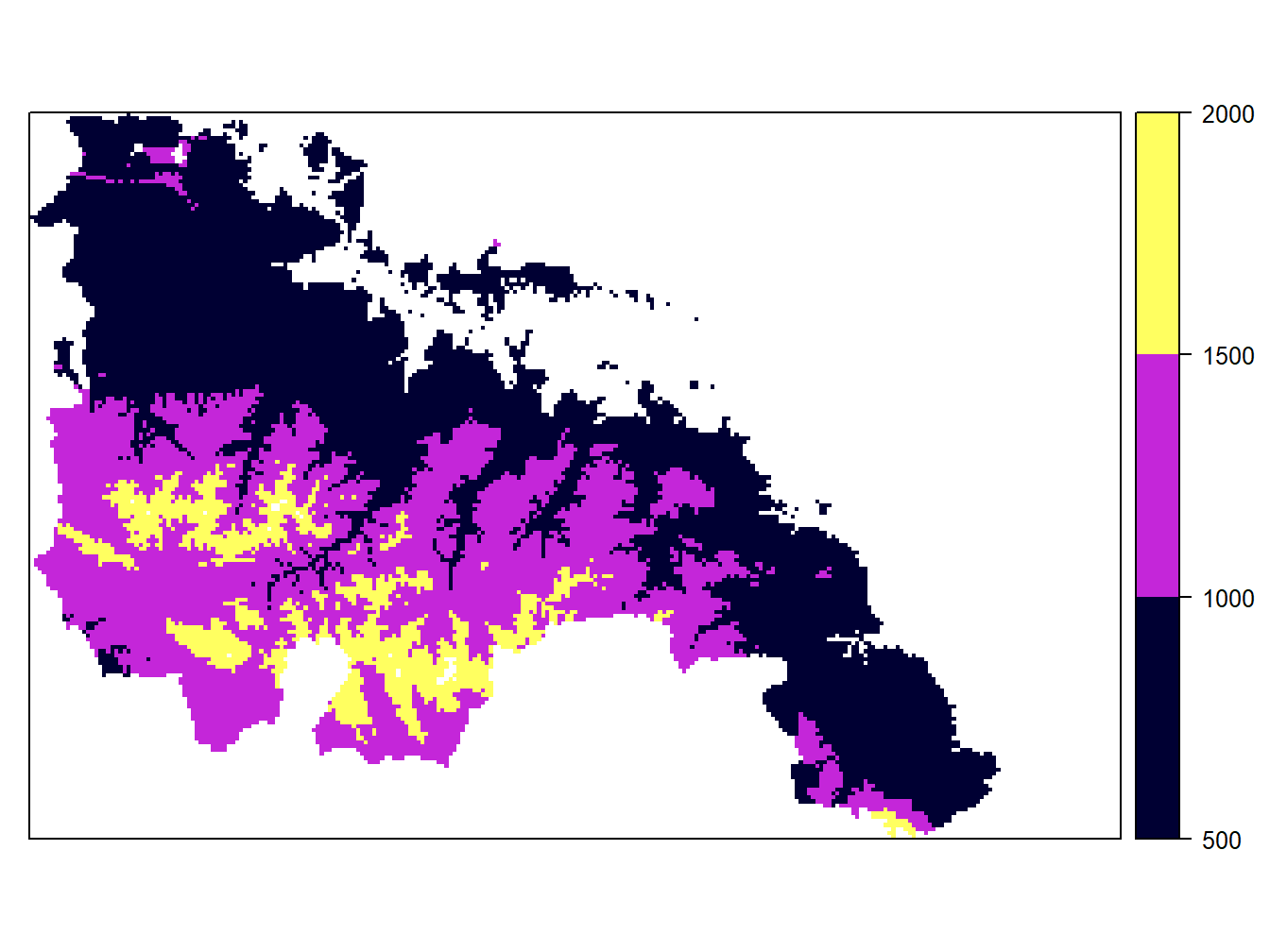
Of course we can change the range of colors. We will use the package RColorBrewer and its function colorRampPalette(). This package gives as some predefined color ramps, but it is more interesting to create our own:
col = colorRampPalette(c("#F4F74A", "#B40404"))
cuts<-c(500,1000,1500,2000)
spplot(dem.rioja,at = cuts,colorkey=list(at=cuts,labels=as.character(cuts)),col.regions = col(3))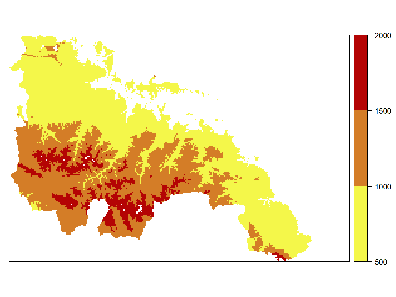 The usual way to pick colors is using hexadecimal color codes. There are many sites and color charts to obtain that information but you can visit this website https://www.w3schools.com/colors/colors_picker.asp if you need a quick reference.
When creating maps with custom intervals we can use any function that allows to build vectors and any function useful to deterimine the max and min value of our data. In the next example I use quantile() to get the quantiles 1, 2, 3, 4 and 5 to map tavg:
col = colorRampPalette(c("#F4F74A", "#B40404"))
cuts<-quantile(tavg)
spplot(tavg,at = cuts,colorkey=list(at=cuts,labels=as.character(cuts)),col.regions = col(6))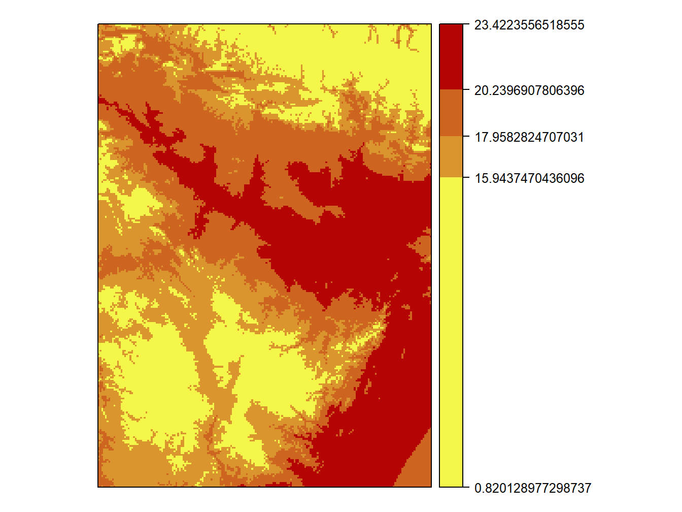
3.2.1 Mapping multiple attributes with spplot
The last thing we will see will be how to build multiple maps, which is only valid for vector layers since they can store multiple attributes. What we do is to replace the parameter where we specify the attribute to represent by a vector with the names of the attributes to represent. This automatically creates a map for each attribute:
cuts<-c(5,10,15,20,25,30)
spplot(stations,c("Tmed_MES","TMed_MAX","TMed_MIN"),cuts = cuts)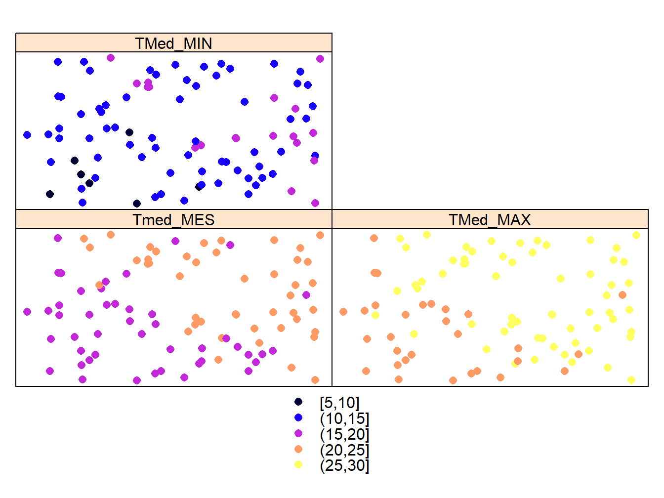
Finally, to save the result in an image we will proceed in the same way as in the case of regular plots:
png("weather_stations.png")
cuts<-c(5,10,15,20,25,30)
spplot(stations,c("Tmed_MES","TMed_MAX","TMed_MIN"),cuts = cuts,col.regions = col(7))
dev.off()
## png
## 23.3 Multiple plots with spplot
Before moving on to the next block of content, let’s look at an alternate way of creating multiple maps with spplot(). We will use the grid.arrange() function of the gridExtra package. This function gives us more control to create mosaics with multiple maps.
Its use is simple. Once installed and loaded the first thing we do is store the maps that we want to combine into objects:
map1<-spplot(dem.rioja)
map2<-spplot(dem.rioja,col.regions=col)library(gridExtra)
grid.arrange(map1, map2, nrow=2)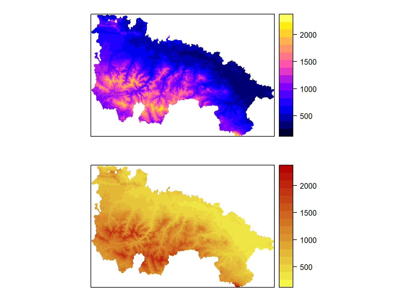
We can arrange maps in different combinatiosn of rows and columns:
grid.arrange(map1, map2, nrow=1)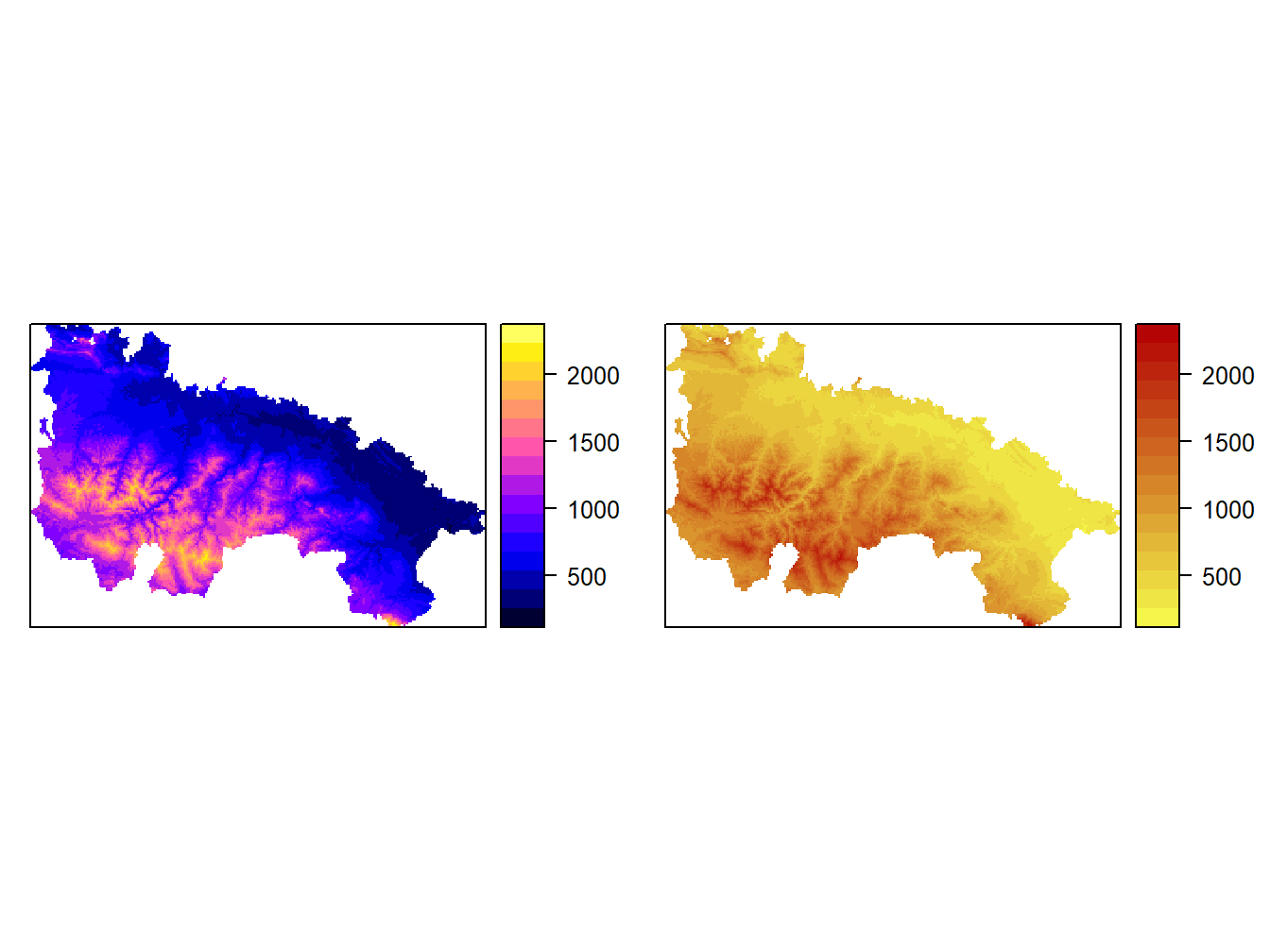
3.4 Mapping with ggplot
ggplot() (package ggplot2) is probably the most powerful plotting tool in R. In addition to create plots and charts of all kinds, it also allows mapping. Unfortunately it is also the most complex alternative in terms of the number of instructions and data format required.
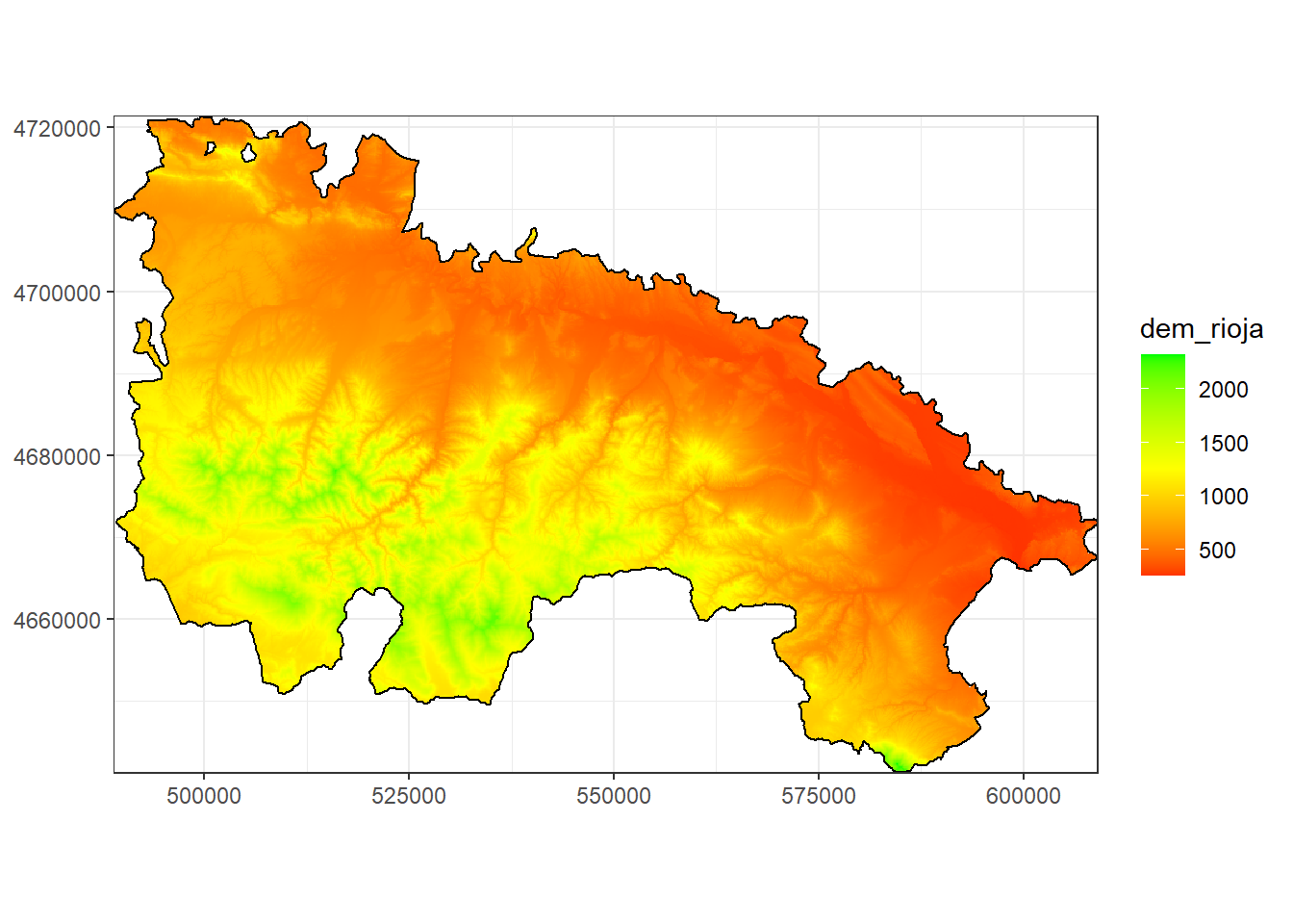
Here we will just see a simple example of how to create a map from a raster layer and overlay a polygon layer:
library(ggplot2)## Warning: package 'ggplot2' was built under R version 3.6.3demPt<-rasterToPoints(dem.rioja)
df = data.frame(demPt)
ggplot(data=df) + geom_tile(aes(x, y, fill=dem_rioja)) +
geom_polygon(data = rioja.ED50,aes(x=long, y=lat,group=group),color="black"
,alpha=0) +
coord_equal() + labs(x=NULL, y=NULL) +
scale_fill_gradient2(low="red", mid="yellow",high="green",
limits=c(minValue(dem.rioja),maxValue(dem.rioja)), midpoint = 1250) + theme_bw() +
scale_x_continuous(expand=c(0,0)) + scale_y_continuous(expand=c(0,0))## Regions defined for each Polygons